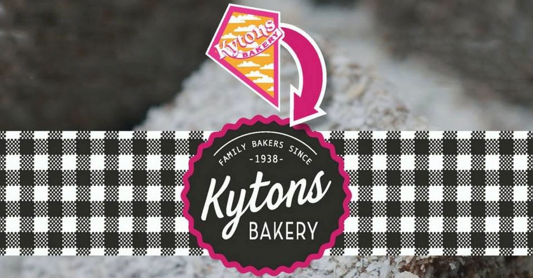
Today we’re really excited to reveal that Kytons has rebranded and we can now release Kytons new logo to the world.
After over 30 years, the kite logo has floated off into history and we’re introducing a fresh new look to our brand.
September 2017, will see Kytons enter its 80th year of baking for South Australians so we thought it was a good time to update our look.
The Royal Show is also coming up at the end of this week, so it was a perfect opportunity to show our new branding off to the thousands of show-goers who visit the Kytons stand each year.
Kytons has rebranded but the pink remains
While the new logo is radically different to the old one, we’ve kept a splash of our distinctive pink in the logo to keep a burst of colour and added a little home-style gingham to reflect what Kytons products represent – the quality and taste that you’d bake at home, if you had the time!
Now that Kytons has rebranded, you’ll see the new branding appearing across the Kytons range over the next few months – starting with the lamington packaging and the Christmas range and don’t forget to come and have a look for yourself at the Royal Adelaide Show.
We’ve certainly learnt that developing a new brand and all the paraphernalia that goes with it is a very intense process but one that we think has been worthwhile with this great new look.
The staff at Kytons as well as some very talented professionals from Literally Brilliant, Baker Marketing, KS Design Studio, OpenBook Howden, Richmond Press, and Jane McLean Design have all been working very hard to get the look just right across all of our packaging, stationery and marketing platforms – we look forward to revealing more of or rebranding in coming weeks and months as we roll it out across our whole range.


